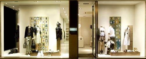
Regardless of the marketing wizardry accomplished on the Internet, visual merchandising is still the most important piece of any brick and mortar retail store’s marketing strategy. Visual merchandising is useful in promoting the sale of goods. It also informs and educates the consumer about inventory, quality, quantity and price — all important and necessary aspects of the buying and selling relationship.
In fact, visual merchandising is so important to the seller–buyer relationship that if you don’t use it correctly it will actually persuade your consumers not to spend money in your store. While almost all retail businesses give lip service to the reigning role of good visual merchandising to the health of their bottom lines, many still regularly make some common missteps.
Mediocre and Untargeted Window Displays
When it comes to your retail space, your windows show the essence of your store, and if you have underwhelming window displays, you’re not only missing out on a great marketing opportunity, you’re actually hurting your brand. Make creative and meaningful window displays a priority by incorporating the following:
-
Change window displays at least 6 times each year. Don’t just stick with the four seasons — play up sports seasons, holidays, cultural festivals, local legends and the like.
-
Experiment. Be bold and create displays along color lines, themes or plot.
-
Make sure the windows are spotless. Clean glass indicates a well-cared for store and business. Be on the lookout for scratches and tape residue and try to keep fingerprints to a minimum.
-
Be your best self. What can a potential customer learn about your business from your window displays? Make sure your window displays convey who you are and what you can deliver accurately and impressively.
Sub-Par Shelving and Showcases
The quality of your shelving and display cases communicates a lot about your opinion regarding your products and the customer experience. If cases or shelves are in disrepair, poorly made, chipped, cracked or in need of a paint job, it will reflect poorly on your business and what you’re trying to sell. If it’s time to update, source your shelving and retail fixtures from a quality company like M Fried. Cutting corners here will only hurt your bottom line.
Poor Color Schemes
Using color can seem more complex than it actually is. While there are an infinite number of shades and hues to choose from, there are really only two principles most retail stores — be they bookstores or independent auto parts outlets — need to bear in mind.
Choose colors that either complement or contrast. When a store is too visually homogenous, your customers’ eyes and minds won’t be engaged. Organize your products so varieties of color abound; this will invite people to keep looking, ensuring more of your products get seen and considered.
Bad or Inadequate Lighting
No matter what you’re selling, the quality of the lighting will affect a potential customer’s reaction. While it’s certainly cheaper, LED and fluorescent bulbs are harsh and unattractive and should be used sparingly. Employ dimmers on all switches so you have more control over the levels of luminosity in your store and in displays.
For more ideas, you can attend the Illuminating and Engineering Society of North America’s LightFair trade show and conference for ideas regarding lighting and lighting design in retail spaces.
Not Using Stories
Human beings are inherently interested in plot lines — those moments of action or dialogue that drive a story forward. Stores rarely make use of an implied narrative in their visual merchandising, and while it isn’t easy to do, it’s highly effective.
For example, you could suggest action from a well-known story; imagine a table set for three with bowls labeled “Mama Bear,” “Papa Bear” and “Baby Bear” to highlight a new dining room set. The feeling something is about to happen will interest and engage customers in your product more than displays with no action.
Poor Visual Communication of Price Levels
One of the most important aspects of visual merchandising is visually communicating price levels. Where you place items on your shelves can impact the way your customers look at them and what they ultimately buy. Placing items of lower value where they can be more easily reached, while displaying higher ticket items away from the floor and within easy line of sight will work wonders in letting your customers know the general cost of items in your store and perhaps subtly persuade them to buy the more expensive item.
Not Strategically Placing Add-ons
With carefully thought-out visual merchandising, you can entice customers to buy add-ons without salesperson pressure. Placing belts next to rows of slacks can increase belt purchases. Placing printer ink in the paper aisle will increase ink sales and keep your customers supplied with everything they need.
Visual merchandising takes some work. However, with a little creativity and the willingness to make it a priority, visual merchandising will stretch your marketing dollars further, while achieving results social media and other forms of marketing are simply unable to achieve.


